7月号/伝統文化をデザインで表現するための三つの「素養」
2013/07/03 月刊商店建築
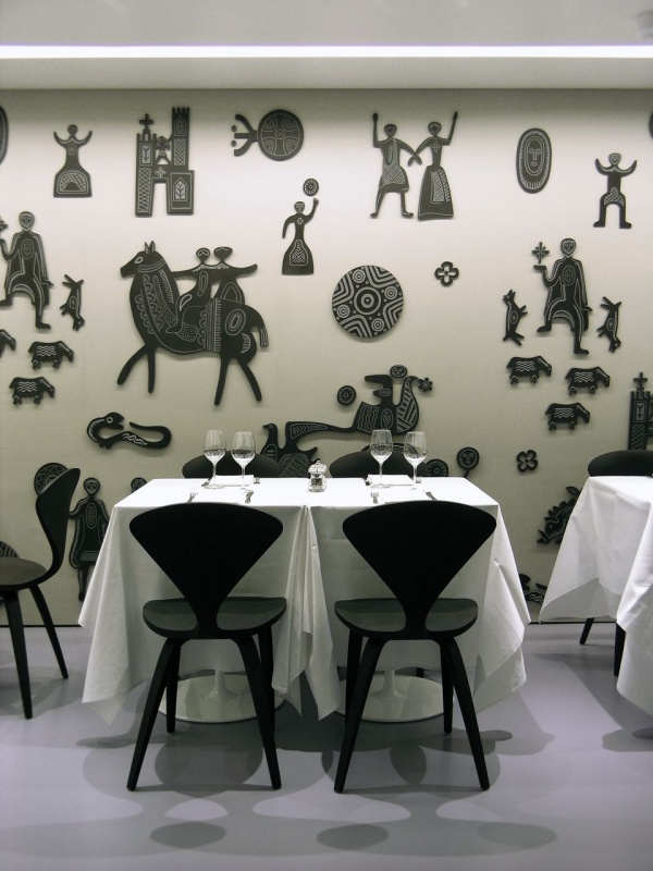
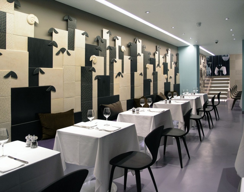
ロンドンのレストラン「オリーボカルネ」。壁面には人工大理石のレリーフ(PHOTO by Riccardo Sanna)
こんにちは。
毎月ご愛読ありがとうございます。
発売になったばかりの「月刊 商店建築」7月号。
どの企画が、設計のヒントになりそうでしょうか。
今月も、多忙なあなたに代わって、最新号を拾い読み。
お時間ある方は、ぜひ書店へ。
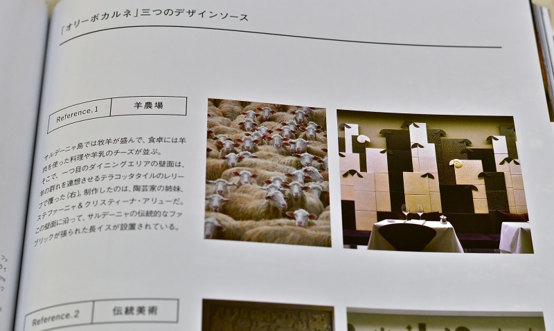
人工大理石のパネルには、サルデーニャ島の伝統的ファブリックの図柄が彫り込まれている(PHOTO by Riccardo Sanna)
7月号の大きな特集の一つが、ダイニングレストラン特集。
その中から、本日ご紹介するのは、ロンドンのレストラン「オリーボカルネ」(7月号 P.122)です。
レストランのオーナーは、伊・サルデーニャ島の出身。この店は、サルデーニャ島の伝統的な肉料理を出すレストランです。
設計を手掛けたのは、イタリアの建築家、ピエールルイジ・ピュウさん。
日本でも、レストランやカフェの取材を毎月していると、ストーリー性や地域性、伝統文化などをどのように空間デザインで表現するか、そんなテーマに挑戦している店舗をたくさん見かけます。
まさにこのオリーボカルネも、サルデーニャ島の伝統文化を、空間デザインでどう表現するか。それがテーマでした。
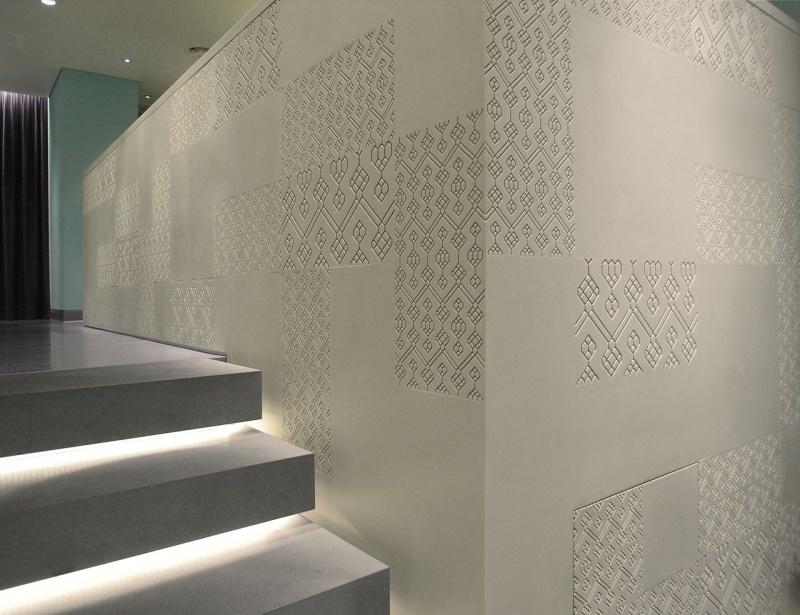
壁面にはテラコッタタイルのアートワーク。羊の群れを連想させます(PHOTO by Riccardo Sanna)
この店では、具象的なアイコンも用いながら、人工大理石などのモダンな素材で、サルデーニャ島の文化を表現しています。
例えば、壁面をご覧ください。ちょっと意外なこの図像。羊の群れを思わせるテラコッタタイルのレリーフが設置されています。サルデーニャ島では、牧羊が盛んなのです。
更に、店内奥のダイニングルーム。羊飼いの田園生活からインスピレーションを受けたアートワークが、壁面に設置されています。農民、騎手、羊飼い、狩人、羊をかたどった、人工大理石のレリーフ。神聖さとキャッチャーさが同居しています。
その他、伝統的な織物の模様から引用した図柄なども店内に使われています。店内がまるでギャラリーのようです。店舗スタッフとお客さんの会話のきっかけにもなりそうですね。
詳しくは、「『オリーボカルネ』三つのデザインソース」(P.125)として整理しました。
さて、サルデーニャ文化を大胆に空間化したこのレストラン。
実は、設計者のピエールルイジさんも、サルデーニャ島の出身なのです。1954年生まれ。フィレンツェの建築大学で学び、その後フィレンツェやパリ、ロンドン、ブリュッセルなどでプロダクトデザインやインテリアデザイン、デザインコンサルティングの仕事をします。ブリュッセルでは、欧州連合の建物の改装プロジェクトなどにも参加しました。
そして、今、ピエールルイジさんは、生まれ故郷のカリアリという街(サルデーニャ島の南部)に設計事務所を構え、世界各地でレジデンスや商業空間の設計を手掛けています。
なぜこうして彼の経歴を書いたのかというと、、、。
このオリーボカルネのデザインが、こうした多様な文化的経験から生み出されたのではないか、と取材をしながら感じたからです。
伝統文化を空間デザインで表現するとき、少なくとも三つの素養が必要なのではないでしょうか。
1:表現する当の伝統文化を設計者自身がよく知っていること。(今回ならサルデーニャ文化)
2:それ以外の文化もよく知って、表現する当の伝統文化を相対化できていること。(今回なら、サルデーニャ文化以外の文化をよく知っていること)
3:その店が立地する街の特性をよく知っていること。その街がどんな雰囲気で、どんな気質の人々が暮らしているのか、など。(今回なら、ロンドンの特性)
この三つです。
ピエールルイジさんは、これらの素養を満たしていたようです。
上記の三つはあくまで仮説ですが、この仮設に基づくなら、デザイナーや建築家が「伝統文化を空間デザインで表現したい」と考えるとき、ふと立ち止まって、「自分自身には、それをする素養が十分にあるのか。ないのだとしたら、どの点が欠けているのか」と、再考してみる必要がありそうです。
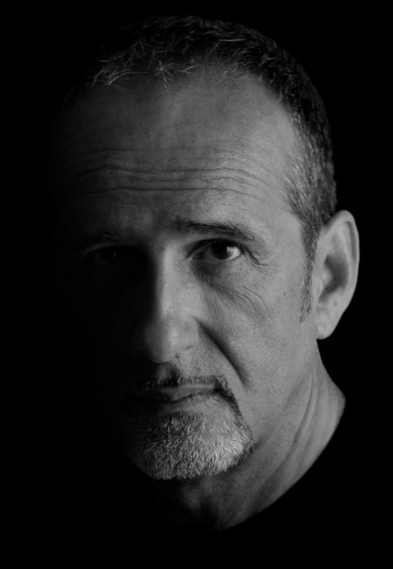
建築家のピエールルイジ・ピュウさん(提供:Architetto Pierluigi Piu)
すみません、今回もまた長くなりました。。。
なお、このオリーボカルネは、「Restaurant & Bar Design Awards 2013」の一次審査にノミネートされています。
アワードの詳細は、ぜひこちら↓をご覧ください。
http://www.shotenkenchiku.com/blog/info&カレンダー/entry-508.html
http://www.restaurantandbardesignawards.com
では最後に。
誌面では、紙幅の都合で、オリーボカルネの解説原稿を、日本語の妙訳(P.124)のみで掲載しましたが、せっかくですので、以下に原文(英語)の全文をお載せします。
本日も、最後までお読みいただき、ありがとうございました。
少しでも皆さんのヒントと刺激になれば何よりです。〈塩田〉
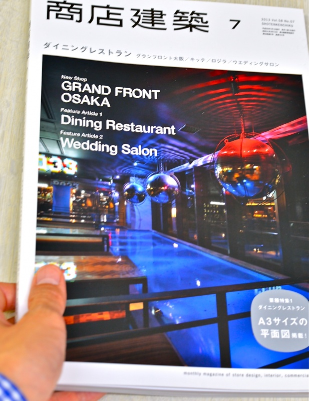
ダイニングレストランづくりのツボが満載の7月号
以下が、ピエールルイジさんによる原稿のフルバージョンです。
OLIVOCARNE Restaurant
It was my intention, when designing this new venue of the London brand OLIVO, to narrate about Sardinia (its proprietor’s as well as mine home island) through iconographic references to the main points of its traditional economy (handicrafts - weaving, in this case - and sheep farming) and and the quotation of the works of a Sardinian contemporary artist, Eugenio Tavolara, who remarkably contributed, along his whole lifetime, to bring out and safeguard the traditional culture of that island. Far from wishing to evoke Sardinia through trite images good for “low cost” tourism, my tale has been told with a language which winks at contemporary design, also resorting to the work of some skilled Sardinian artisans who have moulded a huge bas-relief of bucolic inspiration and given life to a crowd of peasants, horsemen, shepherds, wild boars and hunters which animate the restaurant’s walls in a sort of imaginary gallery evoking Sardinian country life.
The access to the restaurant and its appurtenances opens on the aubergine coloured shopfront. The solid wall which previously divided the entrance from the dining room facing the street has been knocked down and replaced by a full height fire resistant glazed divider, so to give a visual opening and more breath to otherwise too compressed spaces. From the entrance lobby one can access the stairs leading to the upper floor, where is a two rooms bar and a small terrace for smokers, while entering the restaurant one immediately faces a wall cladding in relief - made of texturized and waxed terracotta tiles - evoking a flock of sheeps (artwork by ceramist sisters Stefania and Cristina Arìu) and working as a background for a range of tables (mod. “Dizzie”, produced by the Italian manufacturer Arper) and chairs (“Cherner Chair”, by Norman Cherner, produced by The Cherner Chair Company) made of dark brown bent oak plywood. Along such cladding runs a suspended upholstered banquette, covered with a traditional Sardinian fabric.
Opposite to such wall, on the right as per the entrance, is the reception area, equipped with a dark brown oak sideboard and the manager’s electronic appliances.
Proceeding towards the inner space, one goes through an intermediate dining room marked out by the use of a rather saturated pastel colour (typical of south Sardinia decorative culture) and by an other suspended and under lit upholstered banquette, covered with a black and white wool and cotton fabric used to manufacture pack-saddles typical from the village of Samughéo, in times - now gone by - when horsemen’s provenance was detectable by the pattern of the fabric woven in their home villages. In this same room also appear some introductive elements to the upper dining room located at the rear.
Stepping on a short under lit stair made of Pietra Serena, one gets over a difference of level of about 1,40 metres, gaining access to the widest space of the restaurant, a well proportioned dining room with several tables and seats, as well as an important bar area. This last one essentially consists of a wide counter running beside the steps and leaning, with its side elevation, forward the intermediate room below. Such counter is entirely covered with dove grey Corian®, partially carved according to a pattern drawn on from carpets traditionally woven in the Sardinian village of Mògoro. Behind the counter two long box-like shelves, made out of Corian® as well, characterized by horizontal and vertical sliding panels engraved with the same pattern as the counter, provide enough room to store bottles and glasses.
The facing dining room – covered by an about 17sqm wide skylight providing copious daylight diffused by glass panels engraved the same way – features a bue/purple linen curtain covering a whole wall, from the drapes of which come out four backlit oval mirrors with grinded edges, looking like they were floating with no supports at all. The remaining two walls are entirely covered with dove grey Corian® panels with totally invisible joints. On their surfaces have been spread hundreds of figurines in relief (made and engraved out of dark brown Corian®) portraying stylized animals, folks and various elements of the traditional Sardinian iconography (artwork by Mauro Angius), inspired by the work of the highly esteemed Sardinian artist - who performed as a sculptor, engraver, ceramist, illustrator and designer between the ‘30es/’60es - Eugenio Tavolara.
As an apparent interruption of these decorated surfaces (which, instead, turn down towards the intermediate dining room below, preparing visitors to the surprise they’ll find upstairs) has been installed a full height frameless trapezoidal glazed divider which provides protection against falls on the steps below and is completed by a bespoke brushed stainless steel handrail.
The suspended ceiling is a thermo-stretched membrane produced by the French manufacturer Barrisol. It is micro perforated, so to be permeable to sound waves, which, passing through, brake against a sound absorbing compound located in the gap just above it. In such membrane have been integrated all recessed light appliances, including the asymmetrical linear ones (produced by the Belgian manufacturer Delta Light) providing washing light for all decorated walls.
A gray/purple continuous floor (produced by Kemper System) chromatically links together all features of this interior.
〈Pierluigi Piu〉
盛りだくさんの7月号、ぜひ手に取ってご覧ください!
***************************************************************************************************************************
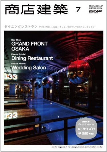
月刊商店建築7月号
新作/グランフロント大阪
ウメキタフロア
キッテ
ロジラ ススムコヤマズ ショコロジー
業種特集1/ダイニングレストラン+図面集
業種特集2/ウエディングサロン
2013年6月28日発売
2,040円(税込)
このエントリーのURL
URL