SHOTENKENCHIKU /October
2025/09/27 2025
SHOTENKENCHIKU is monthly magazine of Japanese interior design / store design / commercial architecture
October 2025, SUMMARY
SPECIAL FEATURE
<70th Anniversary> Playback “SHOTENKENCHIKU” vol.3
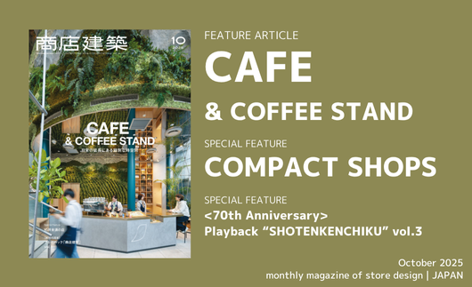
FEATURE ARTICLE
CAFE & COFFEE STAND
SPECIAL FEATURE
COMPACT SHOPS
------------------------------------------------------------------------------------------------------------
SPECIAL FEATURE
<70th Anniversary> Playback “SHOTENKENCHIKU” vol.3
(Page 37)
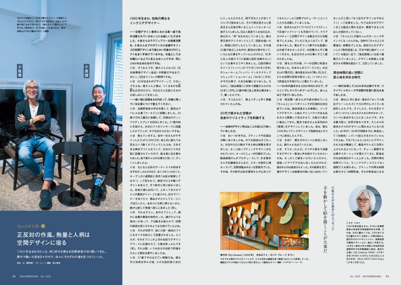
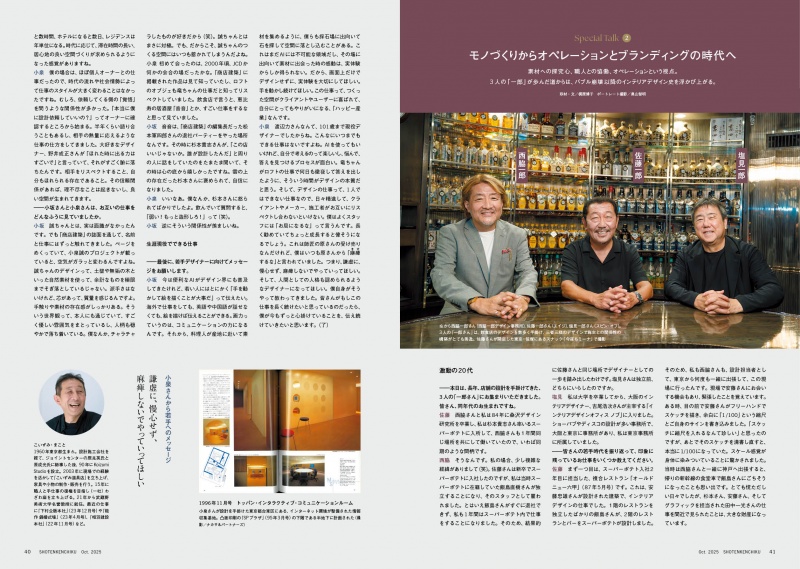
To mark the 70th anniversary of SHOTENKENCHIKU, we
presented a three-part special feature, Playback
“SHOTENKENCHIKU”, in the August, September, and October
issues. The final volume highlights conversations with designers
who have long led the industry, looking back on their formative
years while offering messages to the emerging generation. By
revisiting the stories of those who helped build the field of interior
design, this feature aims to inspire young designers as they
navigate a new era of rapid transformation driven by the rise of AI.
FEATURE ARTICLE
CAFE & COFFEE STAND
L’OFFICIEL COFFEE
(Page 56)
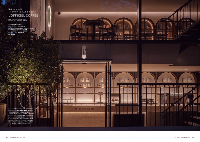
The French fashion magazine L’OFFICIEL, which has been in
publication for over a century, has opened its first-ever café,
L’OFFICIEL COFFEE, in Omotesando, Tokyo. Located on a back
street, the three-story space is entirely dedicated to seating. Archshaped
shelving inspired by the magazine’s iconic logo and
marble finished interior design evoke the refined atmosphere of
Paris. On the second floor, wall art made from past magazine
covers and a display of rare back issues welcome visitors, while
the third floor showcases graphics from the magazine’s very first
covers. Immersed in a Parisian ambience, the café offers guests a
chance to step into the world of L’OFFICIEL.
Designer : KEIJI ASHIZAWA DESIGN
FEATURE ARTICLE
CAFE & COFFEE STAND
KURO MAME TOKYO
(Page 61)
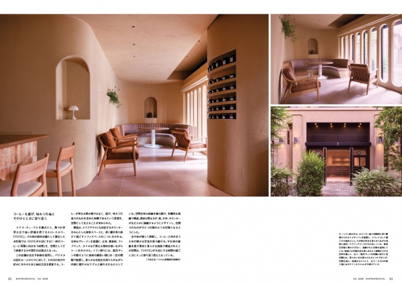
Opened inside a mixed-use complex in Kamiyachō district, KURO
MAME TOKYO marks the first Japanese store of MAME, the
Zurich-based café and roastery. Upon entering, guests are
welcomed into a greige-toned interior where a counter clad in
irregularly patterned tiles sets the tone. The space avoids straight
lines altogether, instead unfolding through gentle, organic curves.
Though finished in different materials such as tile and plaster, the
walls, ceiling, and counter flow seamlessly into one another,
giving the impression that the entire interior has been shaped as a
single vessel.
Designer : masahiro hoshida artisanal architecture
FEATURE ARTICLE
CAFE & COFFEE STAND
NESCAFÉ Sannomiya
(Page 69)
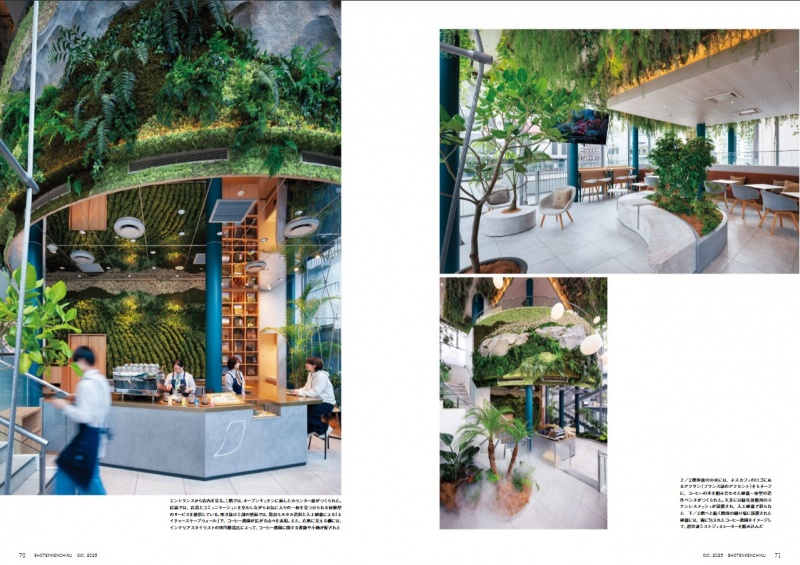
To give them the immersive feeling of being at a coffee farm, we
created a naturescape wall with a bird's-eye view of it from the
back of the counter to the curved wall on the second floor. Next to
the counter on the first floor, we have created an elevation plan of
the collaborative landscape of coffee and shade trees. On the
second floor, we have laid out a custom-made bench in the shape
of the NESCAFÉ accent logo , and by using real coffee trees in
the planting area, we have further enhanced the realism of the
presentation. The shelves are styled with books and accessories
with the coffee farm theme under the supervision of interior stylist
Katsuya Kubokawa, and the cushion covers on the second floor
are also made to match the texture of coffee bags.
Designer : ryokuensha
FEATURE ARTICLE
CAFE & COFFEE STAND
@JP Café
(Page 94)
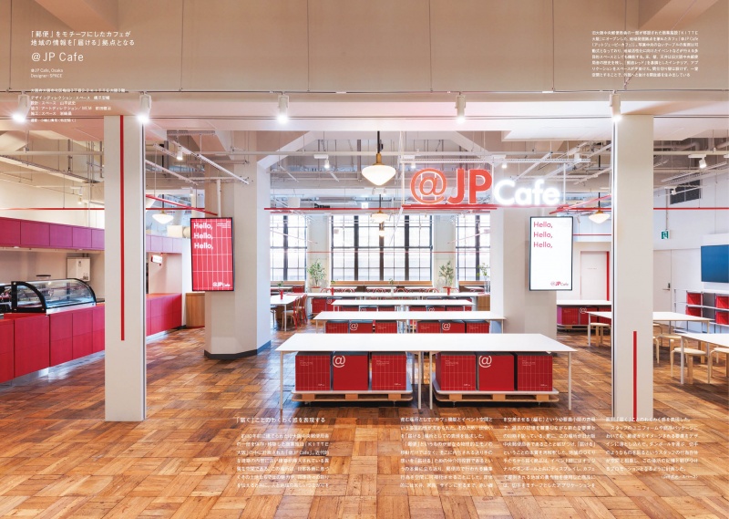
The commercial facility “KITTE Osaka,” opened after relocating
part of the former Osaka Central Post Office building, has
welcomed the opening of the “@JP Cafe,” which also serves as a
regional information hub. Beyond serving as a cafe, it functions as
a multipurpose event space designed to share the appeal of
regions across Japan and foster new connections between people
and communities. The space is composed with a red color
scheme evoking mail, responding to the building's postal heritage.
The motif of “mailing” extends beyond the interior design to staff
uniforms and even the application, making people's actions and
the spatial experience itself integral to the cafe's branding.
Designer : SPACE
SPECIAL FEATURE
COMPACT SHOPS
Nakame no temiyage
(Page 122)
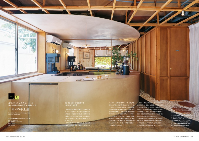
Nakame no temiyage in Nakameguro, Tokyo, is a shop designed
like a garden where you can pause and feel the changing seasons,
tucked slightly off the road along the Meguro River. Mirrors placed
on the wall visible beyond the entrance make the space appear
larger while bringing the surrounding greenery indoors. The
mortar-finished counter is conceived as a feature stone placed
within a garden. By giving it a depth of 900㎜, it serves not only as
a shop counter but also as a versatile space for standing bars,
events, and other uses.
Designer : PERMANENT
SPECIAL FEATURE
COMPACT SHOPS
hana
(Page 125)
Hana, a bar celebrating diverse fragrances, has opened in a
corner of Nonbei Yokocho, Shibuya. While utilizing the existing
structure, a new freestanding structure was added inside. The
floor plan is divided into three equal grids centered around the
staircase. The first floor carries on the alley’s unique culture where
“where you can’t leave without calling out to the person next to
you,” encouraging natural interaction. The second floor features
“dual-purpose furniture” where closing the glass above the stairs
transforms it into a table, creating a space that feels larger than its
actual size. The stairs are covered with a long-pile carpet,
designed to stimulate the senses, starting with smell.
Designer : DDAA
SPECIAL FEATURE
COMPACT SHOPS
Family Meal Cauliflower
(Page 129)
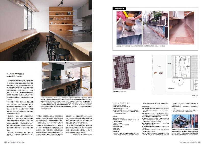
A shared house in a densely populated residential area near
Odakyu Sangubashi Station. By removing the concrete block wall
that obstructed views, the vacant corner room on the first floor
was renovated and reopened as a community kitchen open to the
neighborhood. The vinyl floor tiles were quickly boiled with resin
dye to achieve a unique texture. The exterior steps repurpose
retaining boards used in farmland as both a water source and
approach. The stainless-steel sign in the shape of a pot, evoking
the image of simmering broth overflowing. The space is dotted
with “recipes” reminiscent of the restaurant’s signature “simmered
hot pot” menu item.
Designer : G ARCHITECTS STUDIO
SUBSCRIBE
Print Issue : For overseas subscription and order, please contact to the following
Digital Issue : zinio.com
BACK NUMBER
このエントリーのURL
URL