SHOTENKENCHIKU /November
2024/10/28 2024

SHOTENKENCHIKU is monthly magazine of Japanese interior design / store design / commercial architecture
November 2024, SUMMARY
SPECIAL FEATURE 1
Common areas of Commercial Complex
SPECIAL FEATURE 2
Toilet & Powder Room
SPECIAL FEATURE 3
Accommodations Today vol.1
Infusing New Value into “traditional ryokan”
SPECIAL FEATURE 1
Common areas of Commercial Complex
Shibuya Sakura Stage
(Page 52)
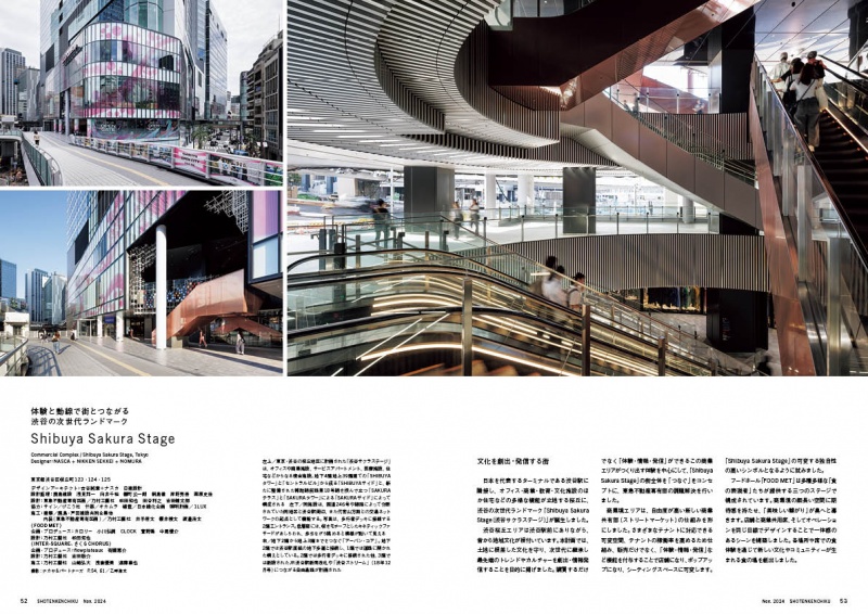
Shibuya Sakura Stage is a complex directly connected to Shibuya
Station, one of Japan’s most busy terminal stations, and consists
of a variety of programs including commercial tenants, offices,
serviced apartments, and a plaza. The Sakuragaoka district, the
site of the project, was located right next to Shibuya Station, but
was an area that felt somewhat distant from the hustle and bustle
of the central Shibuya district. For this reason, the “Shibuya
Sakura Stage” has been designed to have a diverse relationship
with the surrounding area, including a passageway directly
connected to the new ticket gates, a plaza connected to the
pedestrian bridge, and an area open to the street at ground level.
The commercial floor is also designed to provide a continuous
sense of liveliness from the city with functions that are variable
and allow sound rubbers to experience and transmit a variety of
information to the public.
Designer : NASCA + NIKKEN SEKKEI + NOMURA
SPECIAL FEATURE 1
Common areas of Commercial Complex
SHIBUYA AXSH
(Page 66)
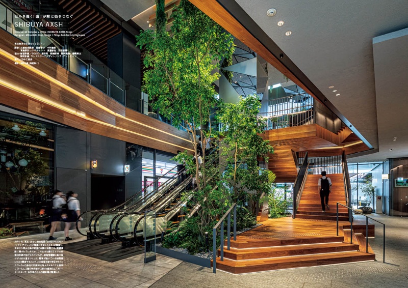
A large-scale 23-story complex with four basement levels opened
in Shibuya, Tokyo. The building’s ground floors 1-4 house
restaurants, an art gallery, and a health screening center, while
floors 5-23 are offices. Standing adjacent to the Shibuya Hikarie
complex directly connected to Shibuya Station, Shibuya AXSH is
connected to Hikarie by a covered pedestrian deck on the second
floor, providing a flow line through the building and easy access to
Aoyama Dori, the Shibuya 2-chome district, and the Shibuya
Cross Tower. The common areas on the first through fourth floors
are filled with planting strips, planters, and vertical garden
greenery suspended from the ceiling, creating a sense of nature.
Designer : Mitsubishi Jisho Design + Tokyu Architects & Engineers
SPECIAL FEATURE 1
Common areas of Commercial Complex
dogenzaka-dori
(Page 76)
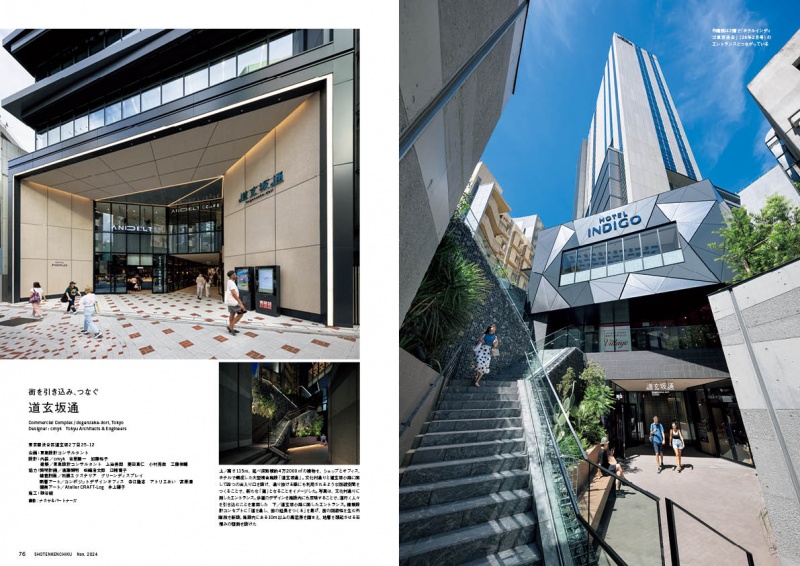
The first and second floors of “dogenzaka-dori” are commercial
areas, facing two streets, Bunka-mura-dori and Dogenzaka Kouji,
with four entrances and exits leading through the facility to other
streets, a complex configuration of passageways that differs from
the usual flow lines of commercial facilities. The flooring of the two
gates facing Bunka-mura-dori is covered with tiles like public
sidewalks, integrating the sidewalk with the floor of the facility and
naturally extending the path, drawing people into it.
Designer : cmyk Tokyu Architects & Engineers
SPECIAL FEATURE 1
Common areas of Commercial Complex
COREDO Nihonbashi
(Page 100)
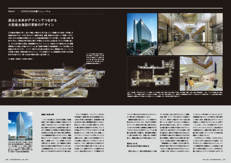
As part of the renovation project of the COREDO Nihonbashi
complex, which opened in 2004, two new restrooms were built
for customers and one for employees. Due to the redevelopment
of the adjacent city block, the space that had previously been a
backyard was to be converted into restrooms. Nihonbashi used to
be an economic and cultural center, and the concept of “sokoitari,”
a design in which the outer fabric of a kimono is subdued, and the
lining is showy, as seen in ukiyoe prints of the Edo period, was
adopted. The two guest restrooms each chose traditional
Japanese colors for their color scheme, blending in with the
design of the existing common environment and creating a
Japanese design that extends from the Edo period to the
contemporary Reiwa era.
Designer : NIHON SEKKEI
SPECIAL FEATURE 2
Toilet & Powder Room
(marunouchi) HOUSE
(Page 110)
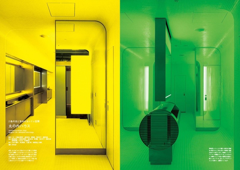
Public restrooms in “marunouchi HOUSE,” a food and beverage
floor on the 7th floor of the Shin-Marunouchi Building in Tokyo,
will be introduced. It is focused on the rainbow color, which is a
symbol of diversity, considering a new way of gender coloring.
The two adjacent colors, yellow and green, are an expression that
softens the gender divide. The custom-made washbasin counter
composed of metal hardware has a strong presence in the space,
proposing a new way of handwashing that embraces the people
gathered there. The sensation of being washed away by the color
of the light transforms the entire restroom experience into
something extraordinary, leaving a strong impression on visitors.
Designer : I IN Mitsubishi Jisho Design
SPECIAL FEATURE 3
Accommodations Today vol.1
Infusing New Value into “traditional ryokan”
SENPOKAKU
(Page 126)
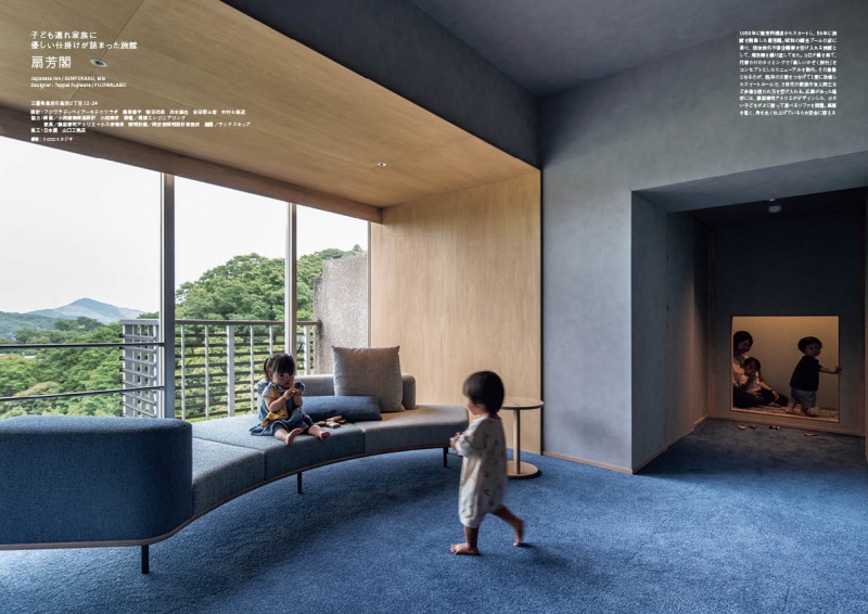
Overlooking Ise Bay, this ryokan was founded in 1950 on a hilltop
in Toba, Mie Prefecture. The hotel underwent a renewal plan for
the Corona disaster and was transformed from a traditional ryokan
for banquets and groups into a ryokan with the concept of “new
family travel”. By removing the walls of the three guest rooms, two
bedrooms, a living space, and a Japanese-style tatami room were
created to enjoy a family vacation. In addition, the restaurant has
been extensively renovated and a new terrace room has been
installed so that meals that were previously served in guest rooms
can now be served in the restaurant. The lounge and snack bar on
the first floor, which were rarely used, were renovated and
transformed into a kids' room and library with original playground
equipment installed.
Designer : FUJIWALABO
SPECIAL FEATURE 3
Accommodations Today vol.1
Infusing New Value into “traditional ryokan”
kojinmari
(Page 153)
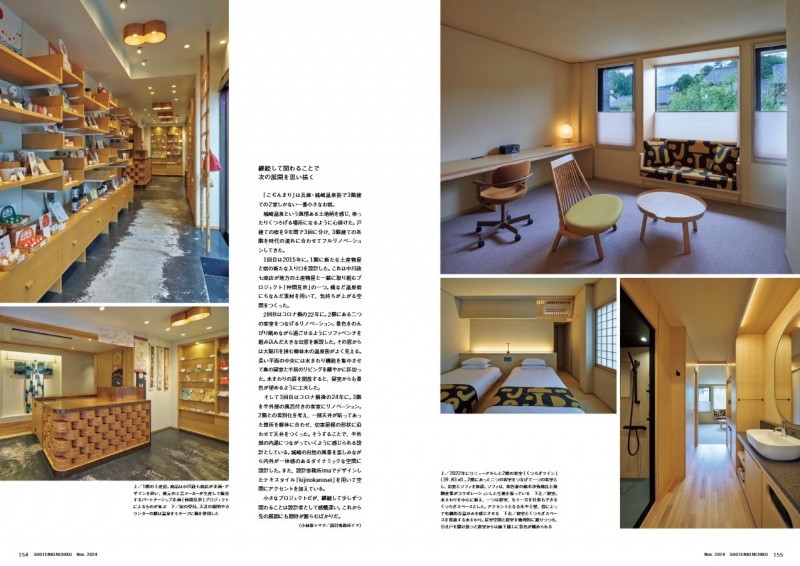
The Kojimari is a small three-story inn with only two guest rooms,
located in the Kinosaki hot spring resort area of Hyogo Prefecture.
It’s a detached inn that has been fully renovated three times in nine
years, with each floor fully renovated to keep up with the times. A
new souvenir shop and a new entrance were created on the first
floor in 2015, and the rooms on the second floor were renovated
in 2022 for the second time. A large bay window with a built-in
sofa bench was created at that time so that visitors could relax
and enjoy the view. The third renovation was in 2024 and included
a guest room with a semi-outdoor bath. Although a small project,
these ongoing renovations, which change little by little to keep up
with the times, give us hope for the future development of the inn.
Designer : Design Office IMA
SPECIAL FEATURE 3
Accommodations Today vol.1
Infusing New Value into “traditional ryokan”
KORIAN
(Page 166)
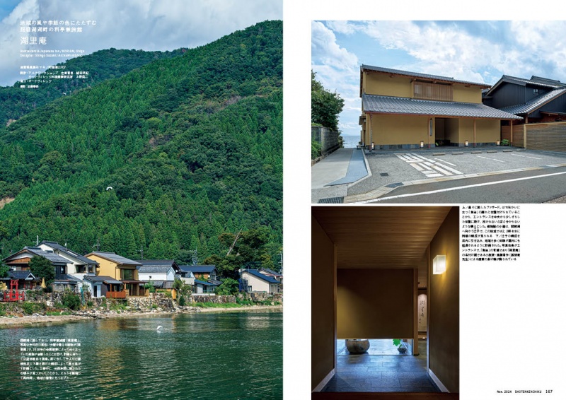
Facing Lake Biwa, the largest lake in Japan, KORIAN is a ryotei,
traditional Japanese-style restaurant and ryokan, Japanese-style
inn. The restaurant was originally built in 1990 as a detached
building of UOJI, a long-established restaurant serving crucian
carp sushi founded in 1784, and was rebuilt in response to the
voices of regular customers after the building was destroyed by a
typhoon in 2018. The building faces Lake Biwa, where strong
winds blow over the surface of the water during high winds, so
the shape of the building was designed to withstand the wind
force. By incorporating into the interior of the building the “zushi”
a form of roadway seen in the surrounding area that leads
between the houses to the lake, a sequence of low-lit alleys with
expansive views to the lake is reproduced indoors.
Designer : ArcheWorkShop + OAK VILLAGE
SUBSCRIBE
Print Issue : For overseas subscription and order, please contact to the following
Digital Issue : zinio.com
BACK NUMBER
このエントリーのURL
URL